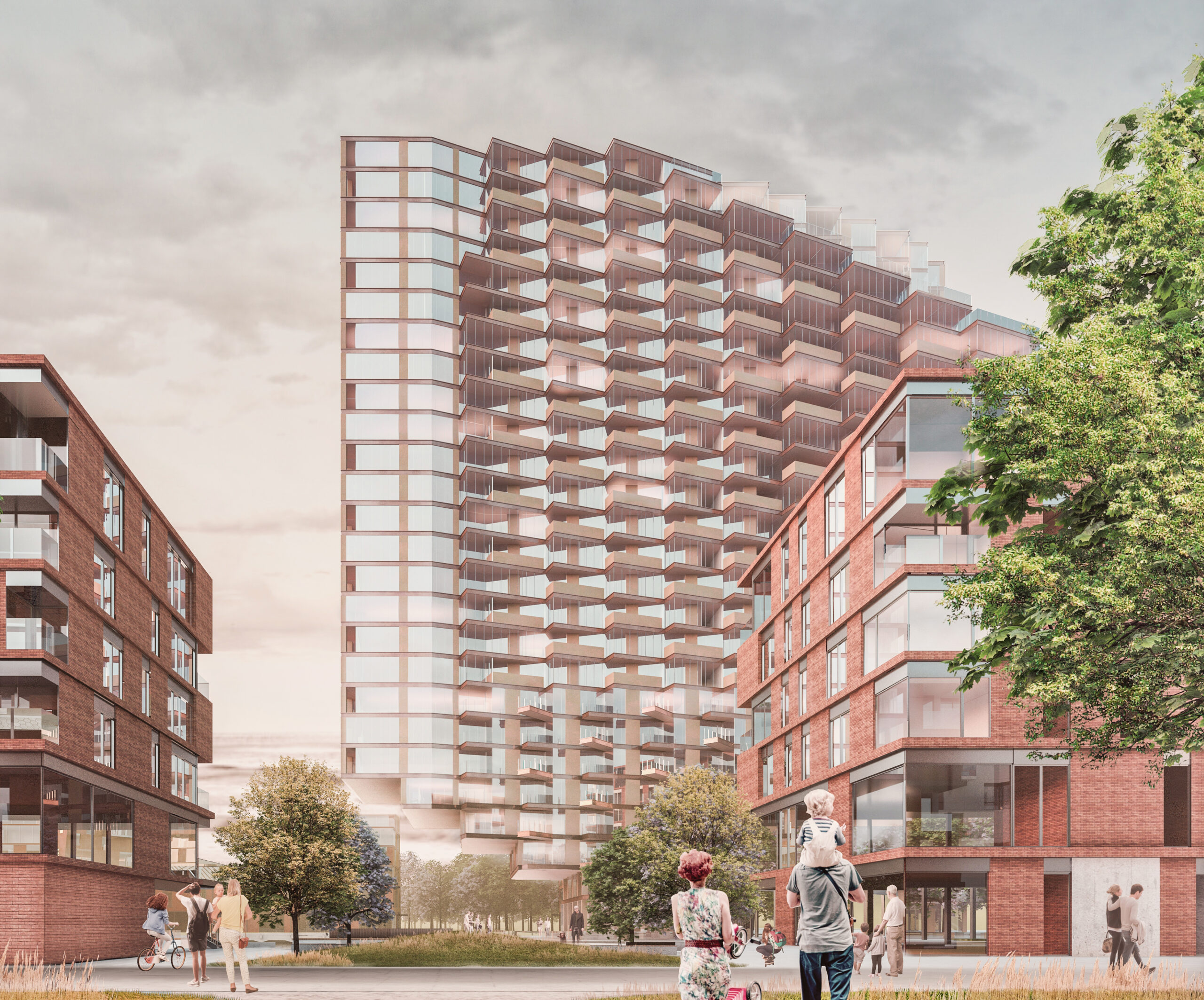
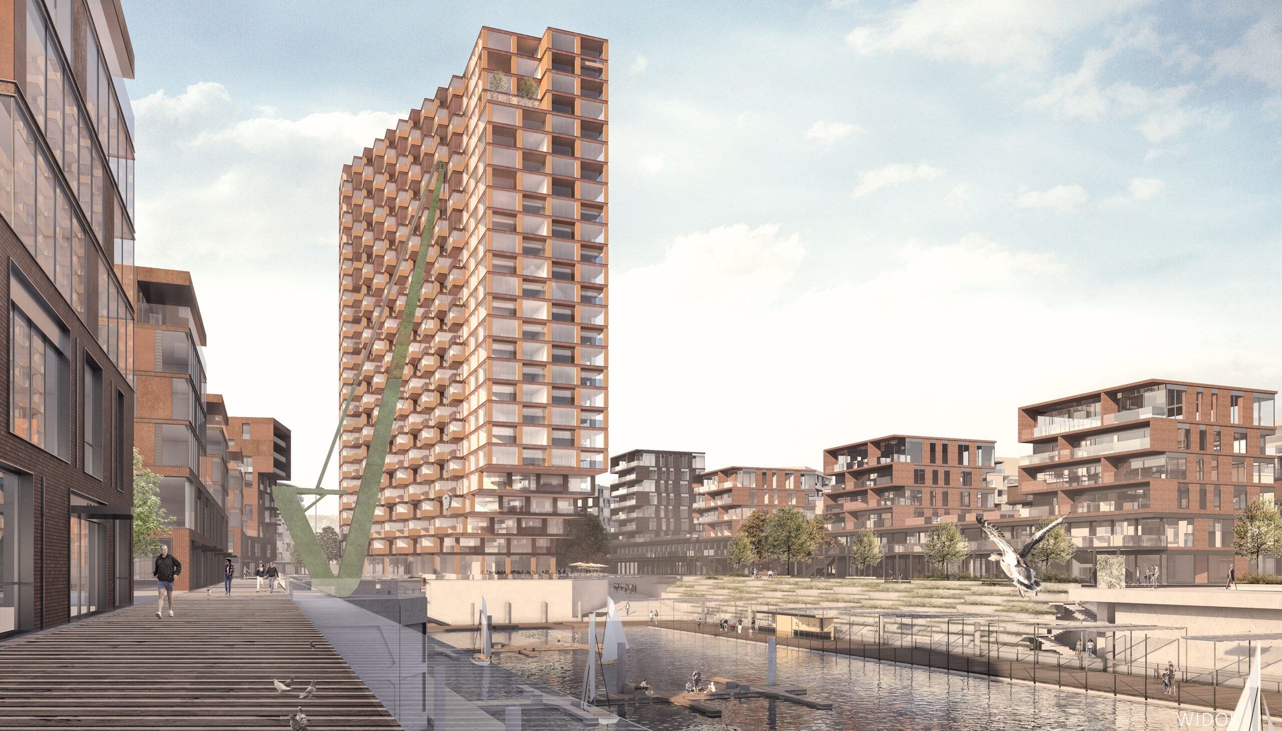
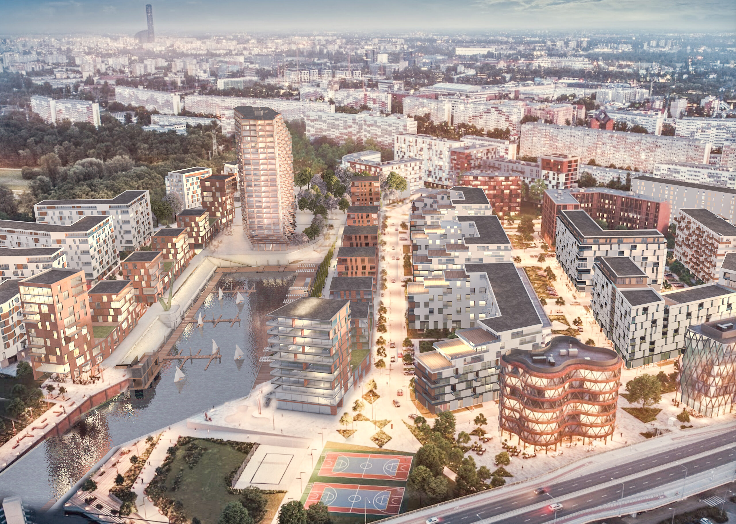
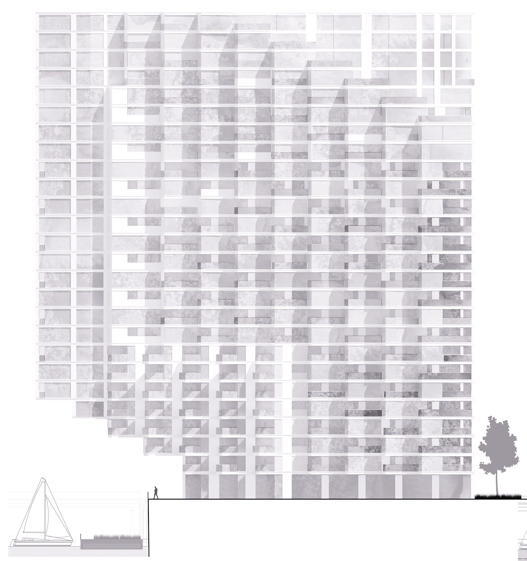
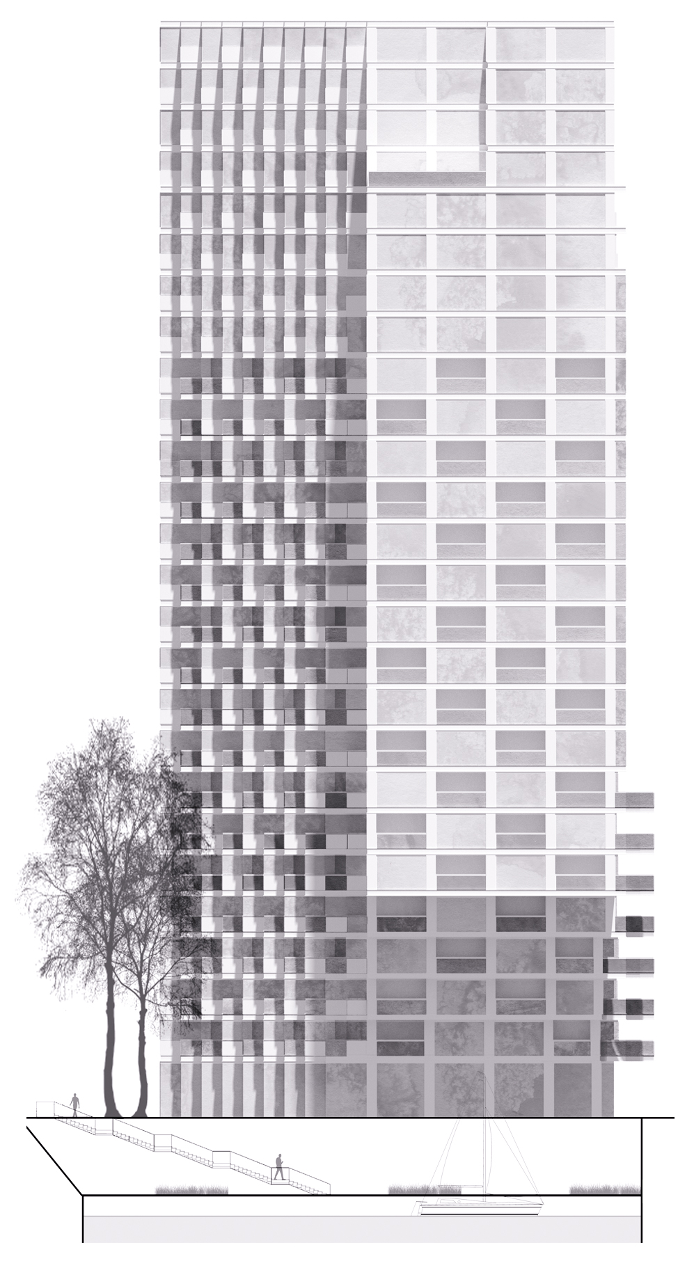
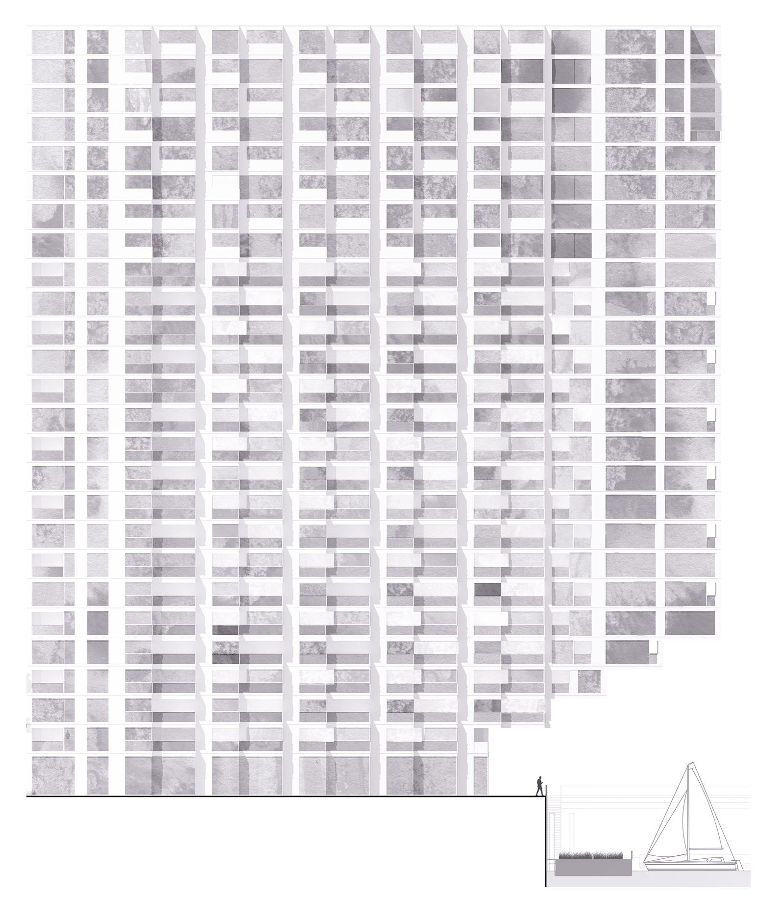
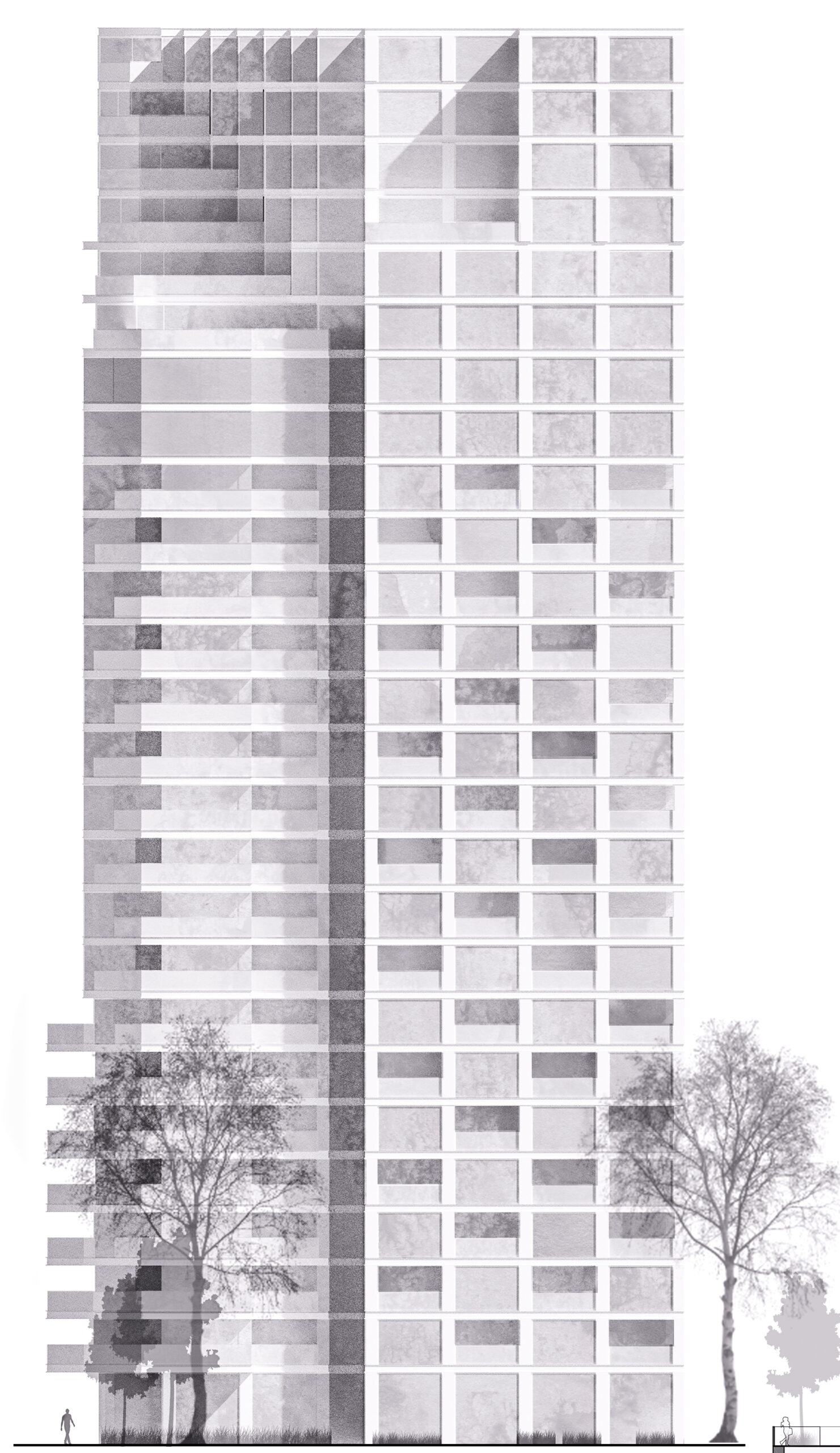
The location of the building that is the subject of the study was planned in accordance with the competition guidelines, on the planned Port Popowice in Wrocław, at the top of the port basin connected with the Odra river. The design takes into account the urban concept of the entire Port Popowice estate, the concept of the port basin development and the conditions of the local Masterplan. Due to the planned residential function, the situation of the building was defined on the basis of the strategy of good sunlight in the living quarters, as well as the maximum use of attractive views of the marina and its connection with the Oder river in the area of the Millennium Bridge.
According to the competition conditions, the designed high-rise residential building should constitute the spatial dominant of the harbor basin axis and, consequently, become an important element of the identity of the entire estate. The context of the investor’s assumptions for the competition entry required the presentation of an original concept with characteristic, recognizable solutions. This determined the choice of the expressive form of the building, inspired by the port cranes, strongly identifiable in the marina.
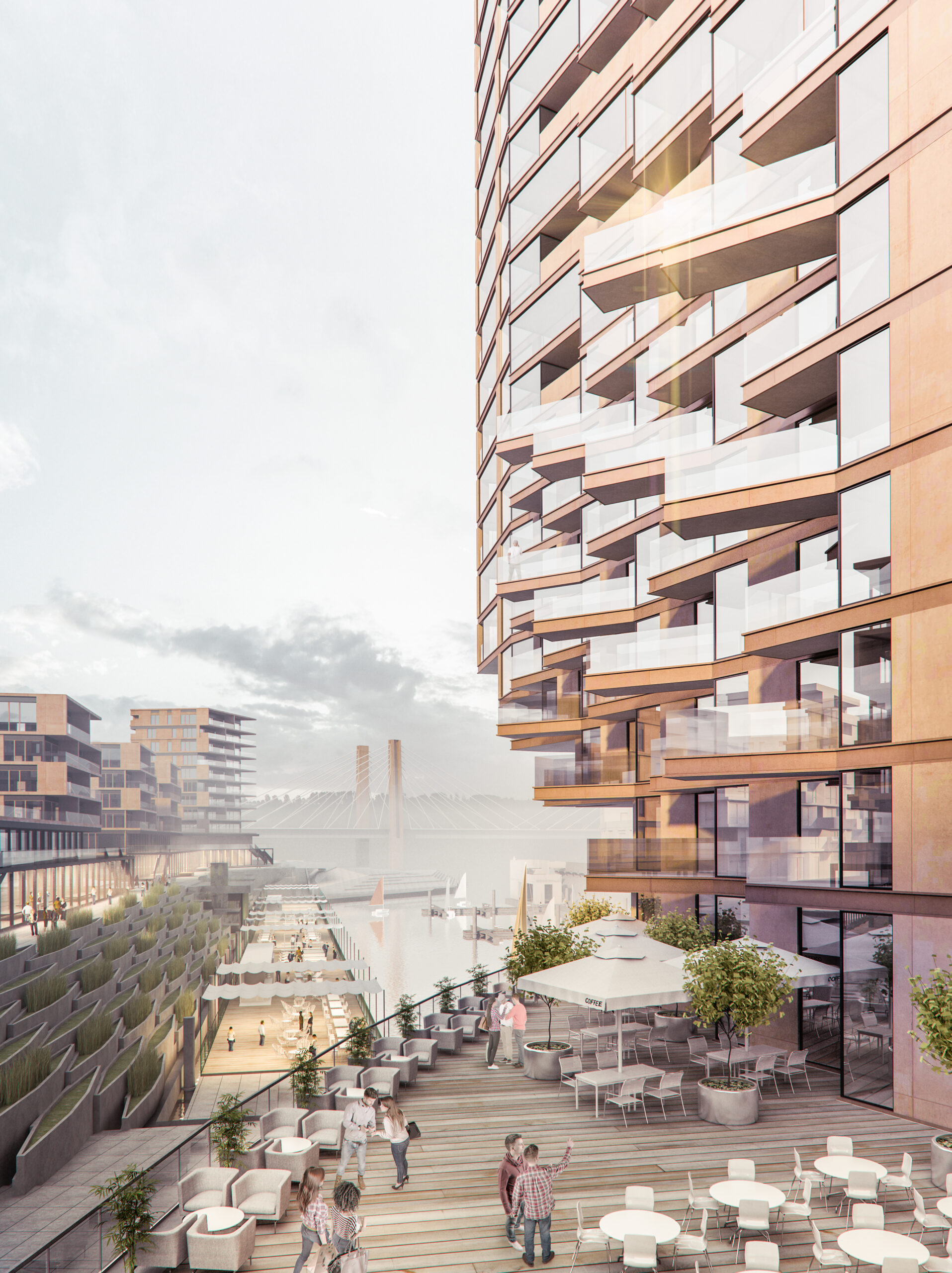
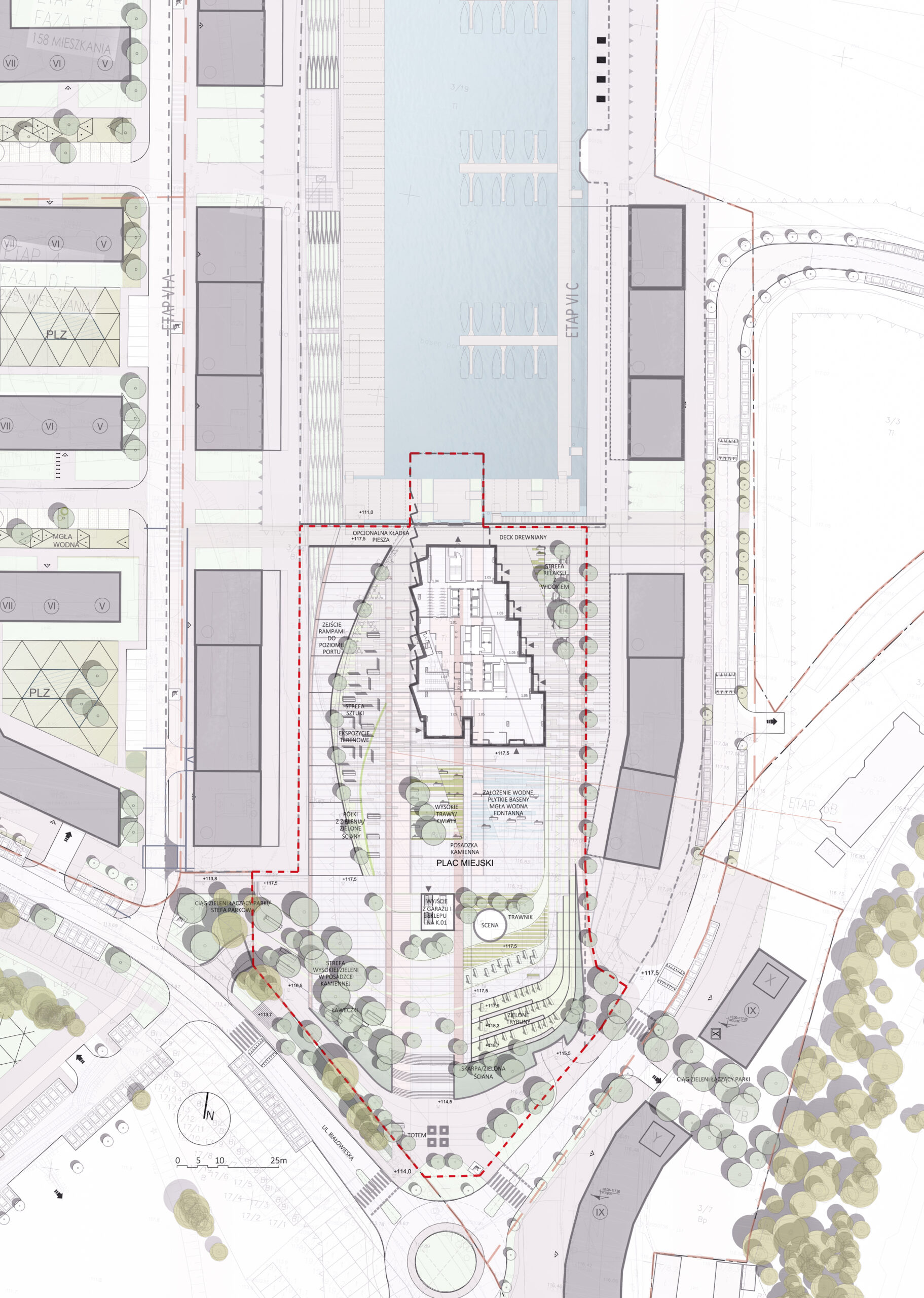
The body of the building and the square in front of it are situated on the axis of the port basin, a few meters above the water surface. The bypass surrounding the building does not create barriers for walkers, whose aim would be to admire the views of the marina from the level of the square and the slopes surrounding the harbor basin.
The ramp-shaped terraced stairs in the port basin development concept cut off the upper level of the coastal terrace in the shape of a gentle arch. The ramp thus formed in this way descending towards the marina creates a platform in the shape of a ship’s side raised above the water surface, on which, in the associative and semantic layer, the body of the building rises like a ship’s superstructure. The project develops these semantic references through the choice of materials and forms, e.g. the bypass and the platform are finished in wood.
The further south, the more the area gradually becomes mineral – the surfaces of the vast square in front of the building are designed to be finished in stone and architectural concrete compositions, optionally supplemented by a program of water features: shallow pools, fountains, water mists. The square also has a wide opening to the underground floor with vertical communication to services / trade, optionally located on the -1 level. The terms of the competition provide the possibility of locating a “Lidl” type general store. Even further to the south, the area is immersed in greenery, culminating in a landscape auditorium covering the entrance to the underground car park. In counterpoint to the strongly accentuated object of the building with its foreground, the vegetation layout is already free and natural, and the surrounding greenery creates the impression of a friendly and spacious urban interior. In the offices created by the higher greenery, field exhibitions related to, for example, the historical identity of the place – with archaeological excavations from the Popowice Port area, are planned.
Building morphology
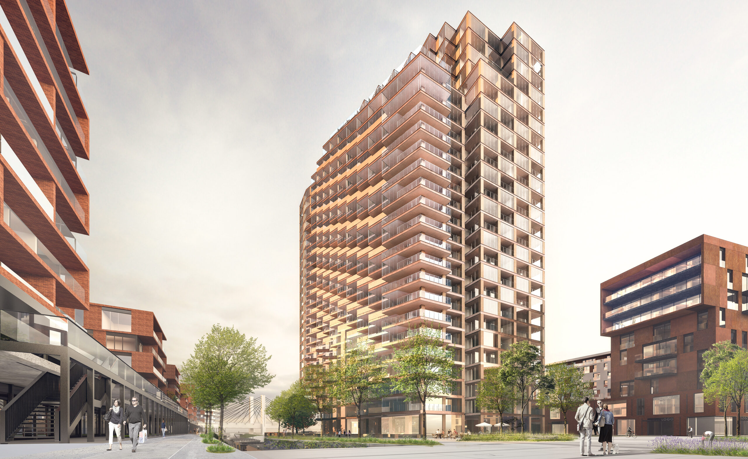
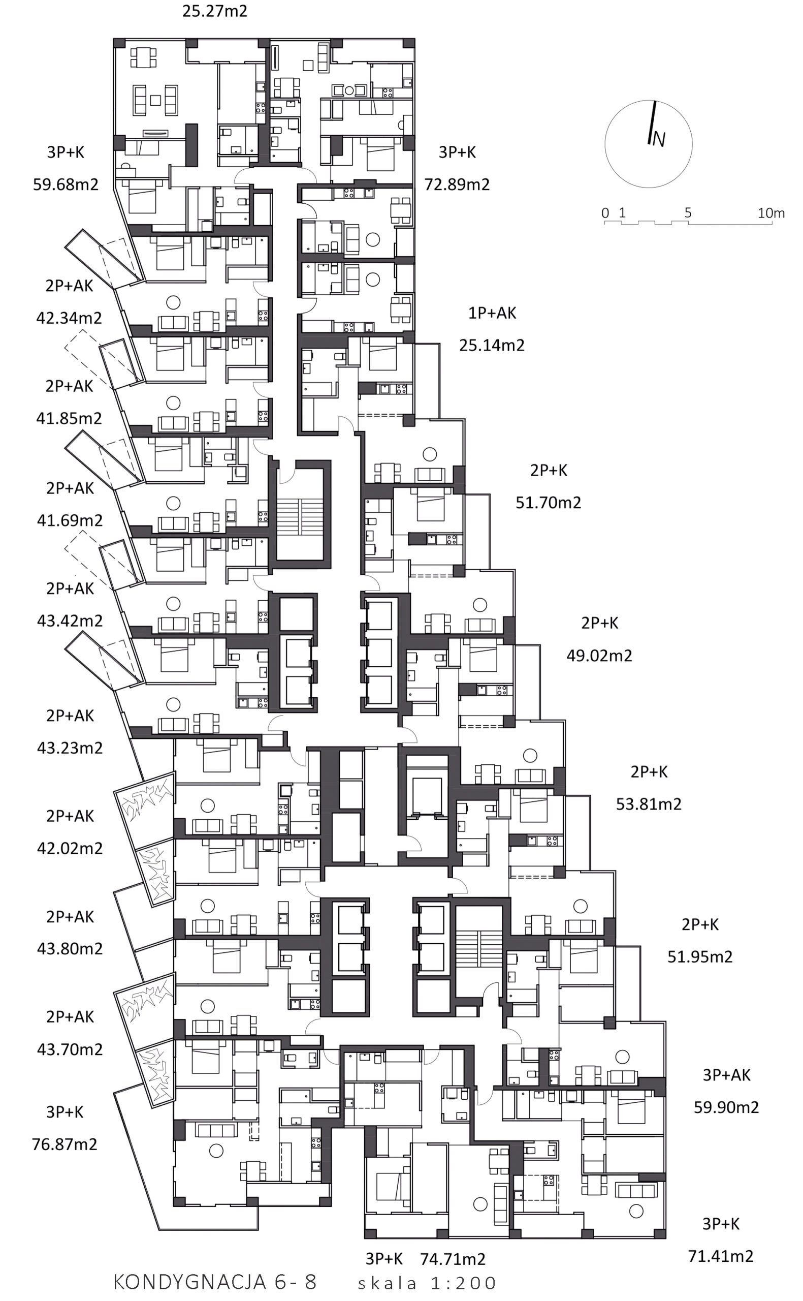
The form suspended above the water surface, inspired by the silhouettes of port cranes, is developed in the sculpting of the entire body of the building. The designed building morphology is not only the result of a search for a specific aesthetics of architectural expression, but it has a functional justification. It is a geometric response to the balance of usable areas expected by the Investor in the context of the impact of the designed building on the development of other quarters of the Port Popowice estate. The logic of the construction of this form is presented in the drawing diagrams. The diagrams illustrate the determinants of geometric concepts resulting from the requirements for shading, shading and insolation, both in relation to the neighboring buildings and in the internal scope of the designed building. The strategy for the location and orientation of residential premises on individual floors, as well as the situation of the entire body of the building, was created as a result of searching for directions of attractive panoramic views of the marina from as many residential premises as possible. The cubes / cubes of individual premises oriented in this way give the possibility of views of the marina also from the theoretically less privileged in this respect than the northern eastern and western facades. In addition, long platform balconies, protruding from the face of the façade, which locally “bristle” the façade, are also solutions that maximize the use of viewing opportunities, but only possible up to the height of 25 m provided for by Polish law. In turn, on the south-west side, a palette of alternative views, the arrangement of terraces connected to the apartments, cascading downwards, with a wide panorama of the city. All the above-described solutions resulting from functional conditions make it possible to use them as elements of aesthetic and formal articulation, which was consciously provided for in the facade composition. According to the authors’ intention, the façade’s architecture should enable the dynamics of its perception. Geometric motifs designed on the facades are intended to create an impression of variability in different perspectives, depending on the directions and distance of the observer from the building. Such dynamics of architectural expression seems to be particularly important in the context of the scale of the designed building.
Function
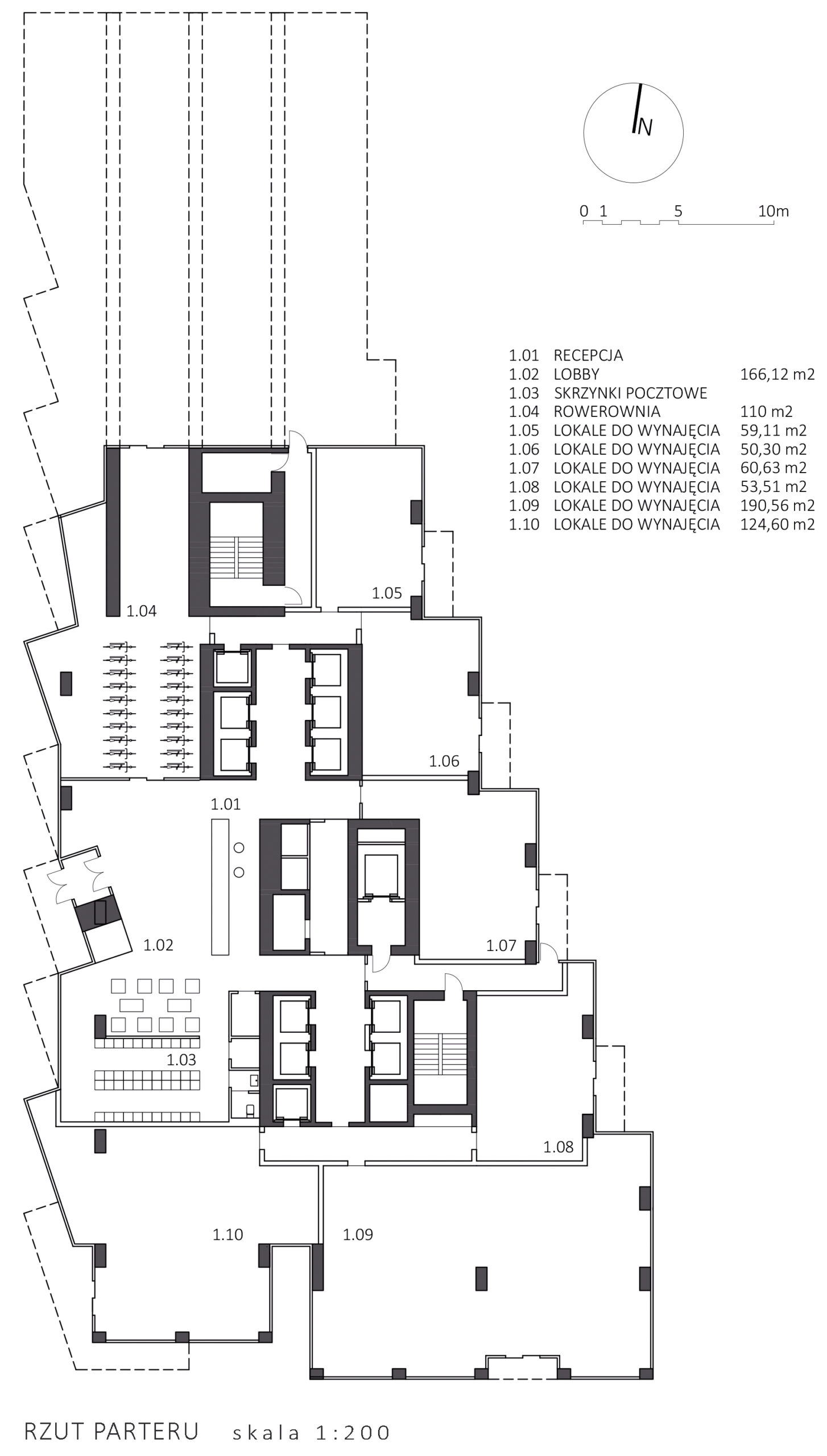
The main entrance to the building is provided from the main pedestrian area that runs along the building towards the marina. It is also one of the most attractive places in the port area – it is located on the platform with a view of the marina and the Millennium Bridge. In addition to the entrance hall to the apartments on the ground floor of the building, there are service / commercial premises for rent with entrances located under the overhangs of cubicles / heaps of higher-floor premises. Flats were located on floors 2-26 in accordance with the logic of the competition conditions: smaller units on the lower floors, larger units with a view of the marina, the largest apartments on the top floor with a representative terrace. Each of the premises has a balcony, terrace or loggia. For some premises on the south-west side, there is space for winter gardens, for others, on the upper floors, extensive cascading terraces with the possibility of arranging external gardens. For residential rooms, a minimum insolation time of 3 hours is provided for in the period provided for in the Technical Conditions. On the 2nd floor, from the side of the marina, there will be a service / catering facility with a separate elevator under the overhang of the building above the water level. As an option, this property can be used, for example, as a tenant’s club.
Construction
A reinforced concrete column-slab structure stiffened with the walls of the communication shafts was adopted as the basic structural solution for the building. The cantilever structure over the port basin in the northern part of the building is designed as Vierendeel beams in a reinforced concrete and steel composition, suspended on a load-bearing reinforced concrete communication core and based on reinforced concrete consoles of the thickened walls of the ground floor. The walls of the basement are designed as slotted, and the foundation as direct – on a reinforced concrete slab in the “white bathtub” technology. In the area of the core with Vierendeel beams, reinforcement of the foundation by piling, e.g. in the Jet Grounting technology, has been adopted.
Description of the proposed material solutions
The idea behind the project is to create a coherent space of the entire facility and the port Popowice housing estate. In terms of the selection of materials and forms, the project does not copy solutions from the neighborhood, but rather develops and complements their palette. The range of material solutions for opaque cladding is based on the compositions of colored architectural concretes and mosaic plasters with the addition of quartz and mica. Horizontal cornice profiles are optionally made of Corten steel. Recesses in the body of the building, loggias – the transition from external mineral motifs to the climate of residential interiors are planned to be finished in materials with subdued, warm colors, preferably organic – formwork, or composite. In the semantic, associative and semantic layer, in counterpoint to the expressive shape of the building, the design uses the selection of materials and forms to achieve the atmosphere described by the concepts of silence, security, balance, order, harmony.
